Stephen Wolfram has written a comprehensive description of how Large Language Models (LLMs), such as ChatGPT, work.
Spreadsheet disasters
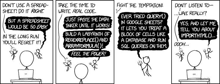
Matt Parker describes what happens when spreadsheets go wrong in the BBC’s "More or Less: Behind the Stats" podcast.
I’ve been writing about this for over a decade and, sadly, little progress had been made.
The cartoon is from xkcd, obviously.
10 ways to mislead with data visualization
PolicyViz have published a useful article on errors you really need to avoid when creating data visualizations.
Dutch giants
This chart crime made me afraid to visit Amsterdam.
I had to rework it to stop the nightmares.
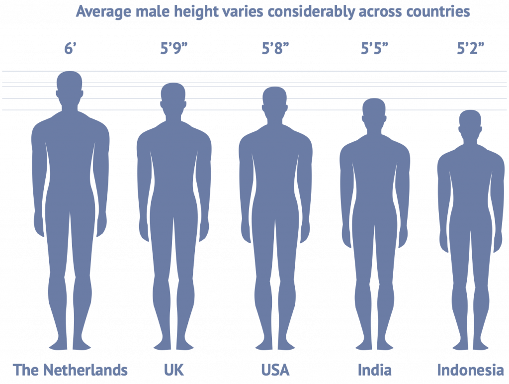
Phew. Everyone looks normal now.
Percentages or proportions?
Don’t store percentages. Normalize them as proportions and format them as percentages for display. If you are representing 20%, record it as 0.2, regardless of how you present this to the user (for input or output).
Having one approach keeps it simple.