Decision Mechanics

Insight. Applied.

  • Services
    • Decision analysis
    • Big data analysis
    • Software development
  • Articles
  • Blog
  • Privacy
  • Hire us

Visual Vocabulary tool

January 4, 2018 By editor

Financial Times Visual Vocabulary tool

Choosing the right type of chart is an essential part of producing an effective data visualization. It’s pointless adding bells and whistles to something that’s fundamentally unsuited to the
message you are trying to convey.

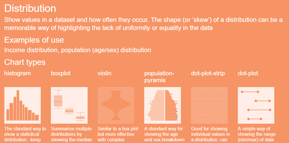
The Financial Times Visual Journalism team have a Visual Vocabulary tool that helps them choose the correct chart for a story. It’s basically a catalog of charts indexed by the following data relationships

  • Deviation
  • Correlation
  • Change over time
  • Ranking
  • Distribution
  • Part to whole
  • Magnitude
  • Spatial
  • Flow

There’s also a PDF poster available.

Print Friendly, PDF & Email

Share this:

  • Email
  • Twitter
  • LinkedIn
  • Facebook

Filed Under: Data science Tagged With: visualization

Search

Subscribe to blog via e-mail

Subscribe via RSS

Recent posts

  • Data Wrangler
  • The Trolley Problem
  • Counting votes using Excel
  • Accuracy vs precision
  • It’s not because we have insufficient data…

Copyright © 2025 · Decision Mechanics Limited · info@decisionmechanics.com