Decision Mechanics

Insight. Applied.

  • Services
    • Decision analysis
    • Big data analysis
    • Software development
  • Articles
  • Blog
  • Privacy
  • Hire us

Visual essays

January 3, 2019 By editor

The Pudding creates visual essays to explain issues of cultural significance/importance.

Visual essays are an emerging form of journalism. Some of the most complex, debated topics get lost in “too long; didn’t read” 10,000-word articles. Visual storytelling makes ideas more accessible[…]"

If you are interested in storytelling with data then you’ll enjoy their work.

Filed Under: Data analysis Tagged With: visualization

Economist charts of the year

January 3, 2019 By editor

The Economist recently selected its (own) 12 favourite charts of 2018.

My favourite is the penalty shoot-out visualisation. A great example of how to present statistical data to a general audience.

I also liked their "Build an American Voter" widget. Apparently I’m not alone as it won them an award.

Filed Under: Data analysis Tagged With: visualization

Paper in “Handbook of Research Methods in Complexity Science”

February 5, 2018 By editor

Handbook of Research Methods in Complexity Science

My paper on visualizing dynamic networks has just been published in the Handbook of Research Methods in Complexity Science.

There’s a discount code for those purchasing in the next three months—VIP35.

Filed Under: Complex systems Tagged With: book, research, visualization

Visual Vocabulary tool

January 4, 2018 By editor

Financial Times Visual Vocabulary tool

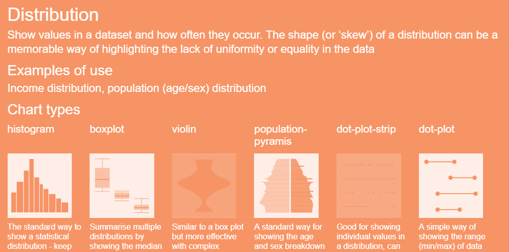
Choosing the right type of chart is an essential part of producing an effective data visualization. It’s pointless adding bells and whistles to something that’s fundamentally unsuited to the
message you are trying to convey.

The Financial Times Visual Journalism team have a Visual Vocabulary tool that helps them choose the correct chart for a story. It’s basically a catalog of charts indexed by the following data relationships

  • Deviation
  • Correlation
  • Change over time
  • Ranking
  • Distribution
  • Part to whole
  • Magnitude
  • Spatial
  • Flow

There’s also a PDF poster available.

Filed Under: Data science Tagged With: visualization

Visualization pioneer, Hans Rosling, dies aged 68

February 9, 2017 By editor

Gapminder screenshot

Hans Rosling has died this week, aged 68. He become famous due to a TED talk he gave in 2006. In the talk he brought international health statistics to life via animated visualizations. He used motion to help viewers make sense of the data.

The software used in his talk was later released as Gapminder and can be used by anyone wishing to display their own data using time-based animation.

Filed Under: Data analysis Tagged With: Gapminder, Hans Rosling, TED, visualization

  • « Previous Page
  • 1
  • 2
  • 3
  • 4
  • Next Page »

Copyright © 2026 · Decision Mechanics Limited · info@decisionmechanics.com