Decision Mechanics

Insight. Applied.

  • Services
    • Decision analysis
    • Big data analysis
    • Software development
  • Articles
  • Blog
  • Privacy
  • Hire us

Data storytelling

January 31, 2023 By editor

If you pay too much attention to social media these days, it appears that we’re failing our clients if we don’t present data as a narrative. Data storytelling is where it’s at. Dataviz (data visualization) is so last year.

This view does a disservice to both dataviz and data storytelling. It fails to appreciate the range of dataviz applications and, by watering down the definition of data storytelling, it undermines the power of narrative in the hands of skilled artisans.

Does everything need to be a story?

There are four main types of writing:

  • Expository
  • Descriptive
  • Persuasive
  • Narrative

Dataviz can be harnessed to each of these aims. It’s just another form of communication.

Sometimes you just want to draw attention to facts (exposition) or explain something (description). While narrative can add to these efforts, it’s not essential to them. I don’t want every article in the Economist to take me on a personal, tension-building journey of discovery. Like Joe Friday—all I want are the facts.

If I’m interested in year-on-year growth, I don’t always need it embedded in a tale about how the company battled the odds to achieve their goals. A clear chart (or table) is more than sufficient.

All four types of writing…actually communication…have an essential role to play. Good descriptive writing—concise, clear and structured—is absent from most business and government output. I really don’t need a "How much tax do you owe?" story. I’m willing to bet you don’t either.

What is data storytelling anyway?

Good question. Definitions are wide-ranging and vague. "Storytelling with data" is typical, but unhelpful. Many seem to suggest it’s dataviz, but done right. Which begs the question of why we’ve been doing it wrong all these years…

Here’s one from HBR:

Data storytelling is the ability to effectively communicate insights from a dataset using narratives and visualizations. It can be used to put data insights into context for and inspire action from your audience.

Apart, arguably, from the use of the word "narrative", this would be equally effective as a definition of dataviz.

Microsoft appear to believe data storytelling can be achieved via a Power BI dashboard.

I’ll resist the temptation to inflict yet another definition of storytelling on the world, but there seem to be some elements that should be part of any story. Plot. Characters. An emotional connection.

Stories have an arc, such as this one from Jack Hart’s excellent Storycraft.

When was the last time a dashboard led you to an emotional climax? Yeah…me too.

Not that dashboards don’t have a role. Well-designed dashboards can communicate valuable information that supports real-time intervention. Powerful stuff. But not a story.

Data storytelling isn’t the ability to interpret and explain charts. That’s good dataviz. Dataviz can compel action without the need for story. A narrative can’t enhance every use of dataviz. Imposing a story on an expository dataviz is a confusing affectation.

Dataviz and data storytelling

Visualization and storytelling are distinct tools. Of course, I sometimes need to use a hammer and a wrench together, but often one will do. And, in direct contravention of my approach to DIY, it’s unwise to use a hammer when you really need…well…anything else.

Brent Dykes, in Effective Data Storytelling, documents the relationship between data, visuals and narrative.
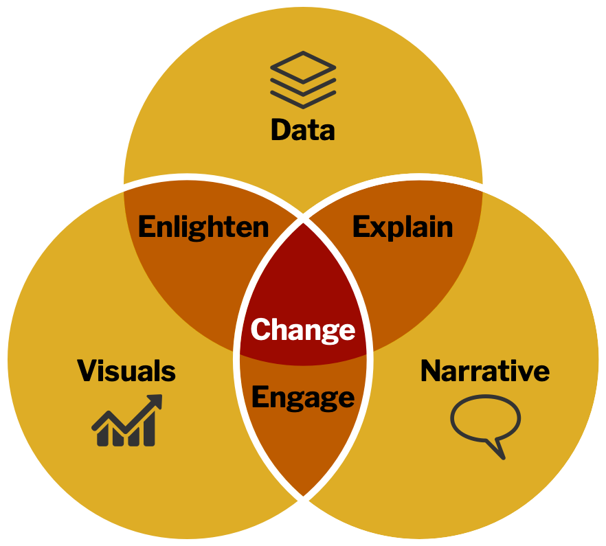
Stories help with engagement, and engagement compels action/change. However, data storytelling is not a replacement for dataviz. It’s a complementary approach that is suitable in certain contexts.

If we see data storytelling as "better dataviz" then we’re in danger of telling stories when we really need to focus on clarity of communication. We can improve dataviz through better choice of charts, clearer labelling, better graphic design, more focused messaging, interactivity, motion, etc.—none of which need a narrative.

And, if we see every dataviz as a data story, then we lose sight of what makes narrative powerful. A tale that takes us on a journey, emotionally engaging us…making us care…building tension…leading to the final resolution/revelation. When the task allows us to do this, it’s heady stuff.

Both…and…

Data scientists need to get better at dataviz. The quality of charts used in organisations (and in certain sections of the media) is appalling. We need less focus on technology and more focus on how to communication visually. The FT’s Visual Vocabulary is a good start—as it the subsequent book, How Charts Work.

By all means, become a better (data) storyteller. It’s another powerful tool. Good dataviz can be enhanced by appropriate storytelling. Just don’t think you have to be a superb storyteller to create outstanding dataviz, or vice versa. They are complementary skills, but each delivers on its own.

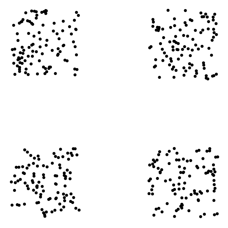
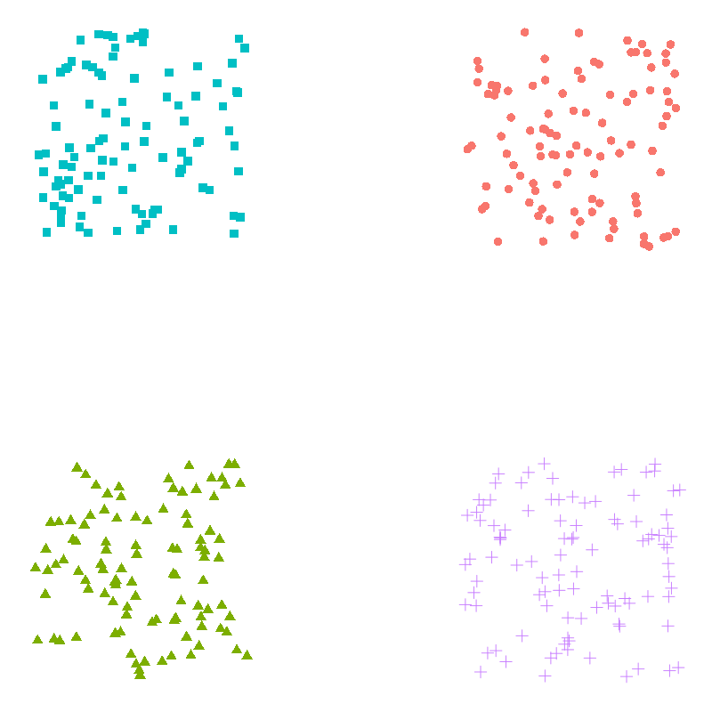
Ultimately, mix it up in any way that gets your point across. The line between exposition and story is fuzzy. I’ll leave you with an example of a simple data story that, while not having much of a plot, is personal and emotionally engaging. Who hasn’t self-consciously reflected on their public-speaking performances? Um… by Lilach Manheim Laurio.
Filed Under: Data science, General Tagged With: storytelling, visualization

Self-driving car from 1958

June 27, 2022 By editor

GM produced a self-driving car prototype…in 1958. There’s a short documentary about it. Required wires in the road rather than machine learning.

Presumably their PR machine said, "They’ll be commercially viable by 1959."

Filed Under: Artificial intelligence Tagged With: GM, machine learning, self-driving car

Sentient AI

June 14, 2022 By editor

Gary Marcus addresses the nonsense in the popular press about Google’s LaMDA AI system being sentient.

He leads with a great quote, from Abeba Birhane, that sums up the whole thing.

we have arrived at peak AI hype accompanied by minimal critical thinking

Filed Under: Artificial intelligence

Is functional programming more effective than object-orientated programming?

June 7, 2022 By editor

Imperative vs functional programming. It’s a debate that goes back to the birth of high level languages—Fortran vs Lisp.

In later years, it was retreaded as object-oriented vs function programming (OOP vs FP)—OOP having become the (massively) dominant software development paradigm.

And, I’m a fully paid up member. I embraced Object Pascal via Delphi 1 on 1995 and have been on the train ever since. I now do a lot of development in C# and teach best-practices.

Problems with OOP

But, just between you and me, I’ve never been truly happy with OOP. I understand the technology fully, but it’s never felt elegant to me. My adoption of Object Pascal had nothing to do with object-orientation. I was seduced by Borland’s state-of-the-art tooling—an IDE that was years ahead of its time. Object Pascal just came along for the ride.

On balance, I’ve found OOP to provide more pain than benefits. Take the three pillars of OOP

  • Encapsulation
  • Inheritance
  • Polymorphism

Encapsulation is great. I’m fully on board with it. But, a module system that allows me to group/isolate my code under namespaces, and hide private code, achieves that. Most modern languages—OOP or FP—deliver on encapsulation.

The benefits of inheritance are massively oversold. I have the scars. I’ve battled the fragile base class problem too many times—grappling with someone’s ill-conceived OO hierarchy that looked compelling in UML.

As for polymorphism, well, again, I’ve no problem with this, but it doesn’t need OOP. Polymorphism can be achieved with lightweight interfaces.

I’ve also failed to see many design benefits of using OOP. Mapping objects to the real-world is an incredibly leaky abstraction. Once you get beyond the high-level design it’s positively unhelpful. It also doesn’t fit very well with TDD. Designing objects to map to the real-world isn’t the same as creating testable classes.

The close coupling of data and behavior also feels unnatural. Maybe it’s my background as a data scientist, but I see code and data as separate things. My code is a pipeline through which data flows and is transformed.

OOP has, however, been wildly successful. It just seems that this success is a consequence of the significant education effort, impressive tooling and modelling techniques that have long been part of the OOP ecosystem. There’s a massive industry that supports, and it supported by, OOP.

Growth of interest in FP

FP isn’t new—Lisp dates from 1958. However, there’s been renewed interest in it in recent years. Much of this is down to growth in "parallel" environments, such as

  • big data frameworks
  • cloud computing
  • GPUs

Functional languages tend to be more naturally parallelizable. They encourage the use of immutable data structures which reduce the side-effects that make code hard to run on multiple processors.

Apache Spark, the current darling of the big data world, is written in the functional language Scala. There’s even a (Haskell-based) functional language for programming FPGAs (CλaSH).

Many of the major OOP languages are also adopting functional features. .NET has LINQ—and most of my C# code is now LINQ with object-oriented plumbing. Java 8 introduced Lambdas. Idiomatic JavaScript is increasingly functional…notwithstanding the introduction of classes in ES6. Swift is often talked about as a functional language. Two prominent modern languages, Rust and Go, avoid classes altogether.

FP is also a natural fit for data science work. R, a popular language amongst data scientists, is functional (as is Excel). Functional languages translate well to interactive, REPL (or playground) environments, making it easy to experiment with code/analysis.

We need more op-ed like a hole in the head

A blog article expressing one guy’s opinion. Well, there’s a novelty. And, the flurry of interest in FP might be no more than fashion. Has anyone done any research?

When looking into this, I found a presentation given at Utah Valley University that pointed to some interesting experiments.

In one study a team at Yale asked teams to code solutions to a problem using a range of programming languages, including

  • Haskell
  • Ada
  • C++
  • Awk

Criteria used to evaluate the solutions were

  • Extensibility
  • Understandability
  • Appropriateness
  • Accuracy
  • Compactness

Haskell, a functional language, was the clear winner. Given the possible variation in the skills of the teams, the study authors then had a graduate student learn Haskell for a week before attempting to code the solution. While not as effective as the experienced Haskell developers’ solution, the student’s submission came in second.

Now, this study was conducted in 1994, and development has moved on a long way since then. So…

Fast forward to 2014 and researchers at the University of California, Davis studied the following question

What is the effect of programming languages on software quality?

To do this, they took a dataset from GitHub. This dataset covered

  • 729 projects
  • 80m lines of code
  • 29000 contributors
  • 1.5m commits
  • 17 programming languages

The projects were real-world products—such as Linux, MySQL, bitcoin, etc.

They concluded that

  • functional languages are better than procedural languages
  • strong typing is better than weak typing
  • static typing is better than dynamic
  • managed memory usage is better than unmanaged

The emphasis on the first point is mine.

Conclusion

Obviously, at the end of the day, use whatever makes you most productive. All experienced developers come with a history (baggage?) that makes then more efficient with certain paradigms, languages, environments, frameworks and technologies—regardless of the objective merits of those technologies.

However, if you are an OOP developer who’s never given FP a serious look (i.e. used it to develop a real-world application), I recommend giving it a try. It’s no longer an academic curiosity. React, the most popular front-end library for web development, encourages FP.

We’ll benefit from continued research into the effectiveness of different programming languages. Having data is so much more useful that a barrage of strong opinions (of which I’m as guilty as the next dev).

Filed Under: Software Tagged With: FP, functional programming, object-oriented programming, OOP, research

Assumptions can ruin your k-means clusters

June 7, 2022 By editor

Assumptions can ruin your k-means clusters

Clustering is one of the most powerful and widely used of the machine learning techniques. It’s very seductive. Throw some data into the algorithm and let it discover hitherto unknown relationships and patterns.

k-means is the most popular of all the cluster algorithms. It’s easy to understand—and therefore implement—so it’s available in almost all analysis suites. It’s also fast. What’s not to like?

When people are first exposed to machine learning k-means clustering is one technique that creates immediate excitement. They "get it" pretty quickly and wonder what it might show when they get back to the office and run it on their own data.

Let’s apply k-means to the following two-dimensional dataset.

scatter plot with four obvious clusters

If we ask the algorithm to identify four clusters we get

scatter plot with four obvious clusters highlighted

No surprise there. That’s good. The clusters are clear as day. If the k-means algorithm suggested anything else we’d be unimpressed.

However, the effectiveness of k-means rests on several (usually implicit) assumptions about your dataset. These assumptions match our intuition about what a cluster is—which makes them dangerous. There are traps for the unwary.

Two assumptions made by k-means are

  1. Clusters are spatially grouped—or "spherical"
  2. Clusters are of a similar size

Imagine manually identifying clusters on a scatterplot. You’d take your pen and circle distinct groups. That’s similar to how k-means operates. It identifies spherical clusters.

The assumption about similar-sized clusters is less intuitive. We’d have no problem manually identifying small, isolated, distinct clusters in a dataset. However, the optimization approach used by k-means—effectively minimizing the distance between all the points in each cluster—can lead it astray.

k-means lacks any judgement. When its simple rules fail it has no ability to reflect on the trade-offs.

Let’s see examples of k-means breaking spectacularly when we deviate from these assumptions.

Non-spherical clusters

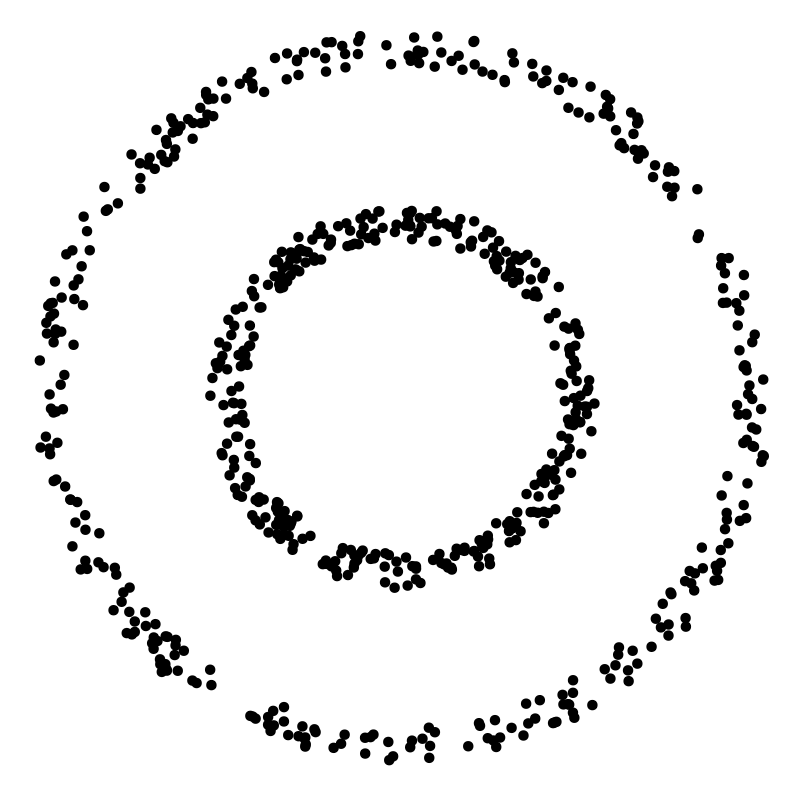
Examine the following scatter plot.

scatter plot with two distinct nested rings

Two clusters, right? Easy. One small ring surrounded by a larger ring. Clear separation between them.

However, only ring is a spherical cluster—the inner one. If you drew a circle around the outer cluster/ring it would have to encompass the inner one. How will k-means handle this violation of one if its core assumptions?

Let’s see.

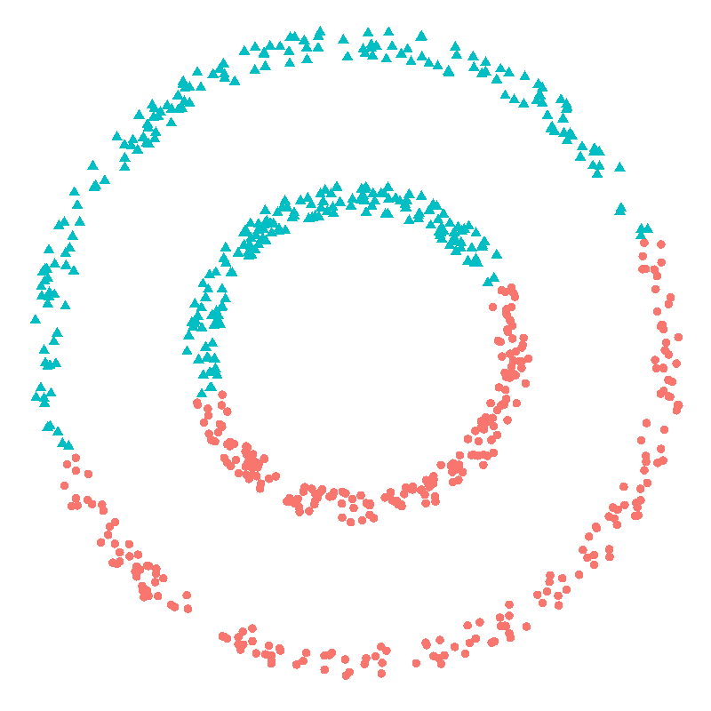
We know there are two clusters so we’ll help by telling it that’s how many we’d like identified. Here’s what it finds.

scatter plot with two distinct nested rings poorly clustered

Oh dear.

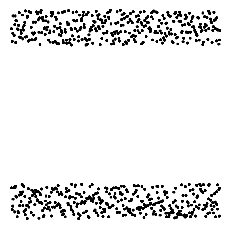
However, we can help the algorithm out. If we understand our domain—and we do in this simple case—we can transform the data into a form that adheres to the aforementioned assumptions.

As we are dealing with circles, if we transform our Cartesian (x vs y) coordinates to polar (arc vs radius) coordinates, we end up with two distinct rectangular clusters. They have the same arc range, but are partitioned by their radii.

scatter plot of nested rings transformed into polar coordinate space

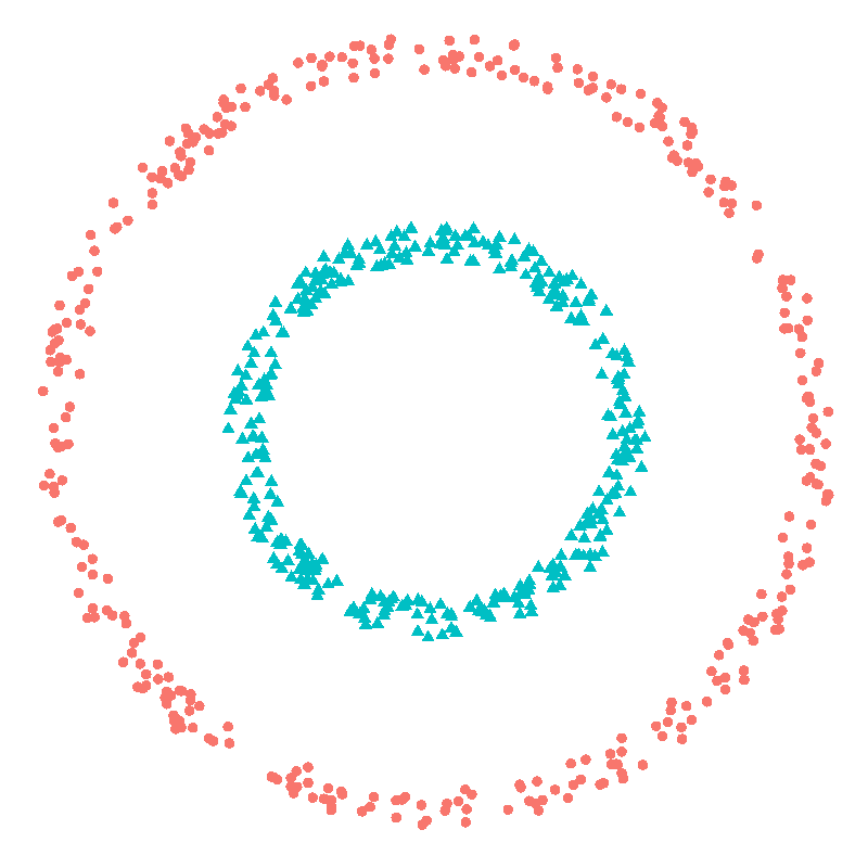
Running k-means on the transformed dataset gives us the following two clusters—displayed using the original Cartesian coordinates.

scatter plot with two distinct nested rings accurately clustered

Perfect. The job of the data scientist is often to set the ball up so that the techniques can hit the back of the net.

Different-sized clusters

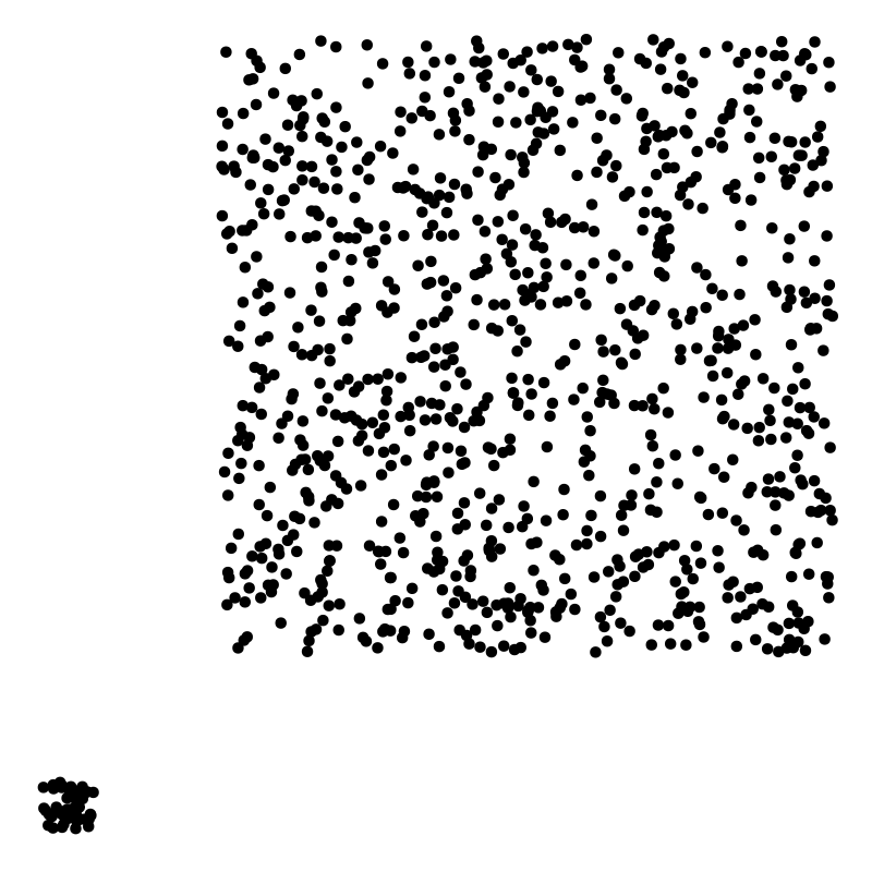
Consider the following dataset.

scatter plot with distinct small and large clusters

Again, there are two obvious clusters. One small, tightly grouped cluster and another, larger, more dispersed cluster. These are spatially grouped, so no problem on that front.

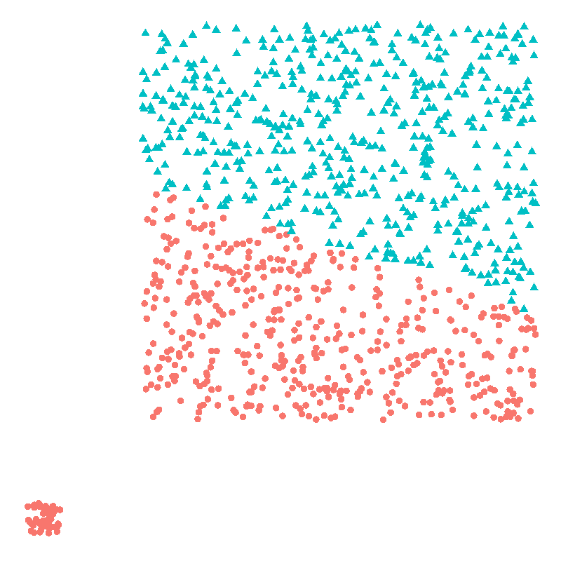
Let’s use k-means to identify our two clusters.

scatter plot with distinct small and large clusters poorly clustered

Hmmm. Not good. What happened here?

k-means tries to produce "tight" clusters. In attempting to minimize the intra-cluster distances between the points in the large cluster it’s "overdone" things and produced two clusters that have similar intra-cluster distances. However, it’s clear that this is a terrible solution for our dataset.

Conclusions

Sadly, we can’t treat machine learning as a black box into which we shovel coal and expect diamonds at the other end. We need to understand the implicit and explicit assumptions in the tools we use and consider how they will impact our results.

k-means clustering is powerful. But it’s blind. And, occasionally, it can make spectacular mistakes. The same is true for all other machine learning methods. Use with caution.

There’s no substitute for being intimately familiar with your data. That’s why the best data science is performed by those who have, or have access to, domain expertise.

Filed Under: Data science Tagged With: k-means

  • « Previous Page
  • 1
  • 2
  • 3
  • 4
  • 5
  • …
  • 59
  • Next Page »

Copyright © 2026 · Decision Mechanics Limited · info@decisionmechanics.com