If you pay too much attention to social media these days, it appears that we’re failing our clients if we don’t present data as a narrative. Data storytelling is where it’s at. Dataviz (data visualization) is so last year.
This view does a disservice to both dataviz and data storytelling. It fails to appreciate the range of dataviz applications and, by watering down the definition of data storytelling, it undermines the power of narrative in the hands of skilled artisans.
Does everything need to be a story?
There are four main types of writing:
- Expository
- Descriptive
- Persuasive
- Narrative
Dataviz can be harnessed to each of these aims. It’s just another form of communication.
Sometimes you just want to draw attention to facts (exposition) or explain something (description). While narrative can add to these efforts, it’s not essential to them. I don’t want every article in the Economist to take me on a personal, tension-building journey of discovery. Like Joe Friday—all I want are the facts.
If I’m interested in year-on-year growth, I don’t always need it embedded in a tale about how the company battled the odds to achieve their goals. A clear chart (or table) is more than sufficient.
All four types of writing…actually communication…have an essential role to play. Good descriptive writing—concise, clear and structured—is absent from most business and government output. I really don’t need a "How much tax do you owe?" story. I’m willing to bet you don’t either.
What is data storytelling anyway?
Good question. Definitions are wide-ranging and vague. "Storytelling with data" is typical, but unhelpful. Many seem to suggest it’s dataviz, but done right. Which begs the question of why we’ve been doing it wrong all these years…
Here’s one from HBR:
Data storytelling is the ability to effectively communicate insights from a dataset using narratives and visualizations. It can be used to put data insights into context for and inspire action from your audience.
Apart, arguably, from the use of the word "narrative", this would be equally effective as a definition of dataviz.
Microsoft appear to believe data storytelling can be achieved via a Power BI dashboard.
I’ll resist the temptation to inflict yet another definition of storytelling on the world, but there seem to be some elements that should be part of any story. Plot. Characters. An emotional connection.
Stories have an arc, such as this one from Jack Hart’s excellent Storycraft.

When was the last time a dashboard led you to an emotional climax? Yeah…me too.
Not that dashboards don’t have a role. Well-designed dashboards can communicate valuable information that supports real-time intervention. Powerful stuff. But not a story.
Data storytelling isn’t the ability to interpret and explain charts. That’s good dataviz. Dataviz can compel action without the need for story. A narrative can’t enhance every use of dataviz. Imposing a story on an expository dataviz is a confusing affectation.
Dataviz and data storytelling
Visualization and storytelling are distinct tools. Of course, I sometimes need to use a hammer and a wrench together, but often one will do. And, in direct contravention of my approach to DIY, it’s unwise to use a hammer when you really need…well…anything else.
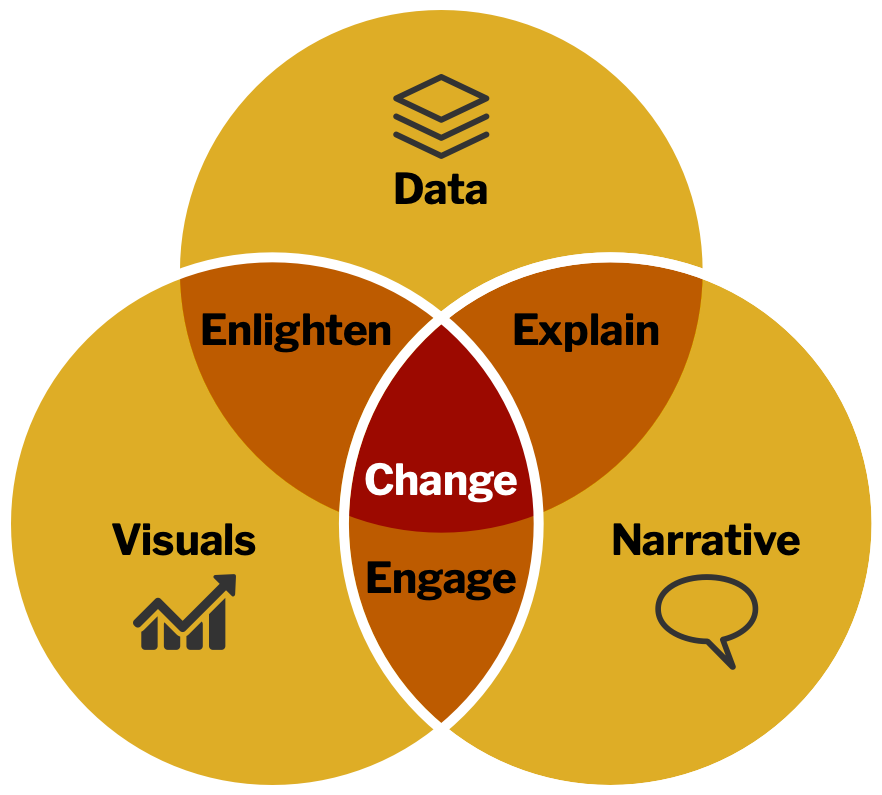
Brent Dykes, in Effective Data Storytelling, documents the relationship between data, visuals and narrative.

Stories help with engagement, and engagement compels action/change. However, data storytelling is not a replacement for dataviz. It’s a complementary approach that is suitable in certain contexts.
If we see data storytelling as "better dataviz" then we’re in danger of telling stories when we really need to focus on clarity of communication. We can improve dataviz through better choice of charts, clearer labelling, better graphic design, more focused messaging, interactivity, motion, etc.—none of which need a narrative.
And, if we see every dataviz as a data story, then we lose sight of what makes narrative powerful. A tale that takes us on a journey, emotionally engaging us…making us care…building tension…leading to the final resolution/revelation. When the task allows us to do this, it’s heady stuff.
Both…and…
Data scientists need to get better at dataviz. The quality of charts used in organisations (and in certain sections of the media) is appalling. We need less focus on technology and more focus on how to communication visually. The FT’s Visual Vocabulary is a good start—as it the subsequent book, How Charts Work.
By all means, become a better (data) storyteller. It’s another powerful tool. Good dataviz can be enhanced by appropriate storytelling. Just don’t think you have to be a superb storyteller to create outstanding dataviz, or vice versa. They are complementary skills, but each delivers on its own.
Ultimately, mix it up in any way that gets your point across. The line between exposition and story is fuzzy. I’ll leave you with an example of a simple data story that, while not having much of a plot, is personal and emotionally engaging. Who hasn’t self-consciously reflected on their public-speaking performances? Um… by Lilach Manheim Laurio.
