Familiar with R and wondering what Microsoft R Open and Microsoft R Server bring to the table? Then check out Lixun Zhang’s article.
Tufte in R
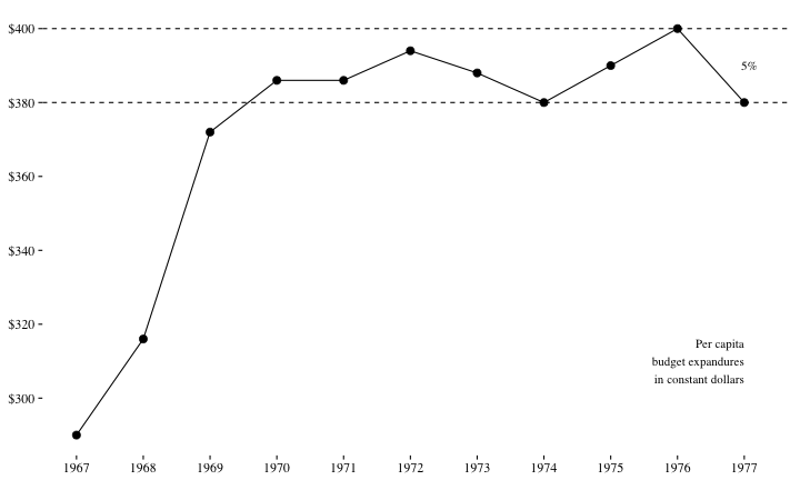
Lukasz Piwek maintains a resource that shows how the visualization practices developed by Edward Tufte can be replicated in R.
His neat Tufte in R site currently contains examples of the following visualizations
- minimal line plot
- range-frame (or quartile-frame) scatterplot
- dot-dash (or rug) scatterplot
- minimal boxplot
- minimal barchart
- slopegraph
- sparklines
- stem-and-leaf display
It’s a living resource, so he’s adding to the collection over time.
Example code is given for R base graphics, lattice and ggplot2.
Overview of Microsoft R Server
Learning Tree just published my overview of Microsoft R Server.
The cost of bad data
Lemonly, a data visualization company, have produced an intriguing infographic on the cost of bad data.

Read the full blog post.
What Nathan Yau uses to visualize data
Nathan Yau of FlowingData has published an up-to-date list of what he uses to turn raw data into his impressive visualizations.
What’s always striking about the tools he uses is that there’s no “quick fix”. He utilizes a range of industry standard data manipulation (e.g. R) and graphic design (e.g. Adobe Illustrator) tools in his work.
I particularly liked his comments on processing and formatting data
Assuming I have the data I want (big assumption), this is a stage of tedium. Solutions typically reflect my state of I-want-this-to-be-done-already, and I use whatever tool is closest. I would use a hammer if I could.